![]()
Updated Dec-2024 Exam Engine or PDF for the TDS-C01 Tests Free Updated Today!
Ultimate Guide to Prepare TDS-C01 with Accurate PDF Questions
Tableau TDS-C01 exam is a challenging exam that requires a solid understanding of Tableau Desktop software. Individuals who wish to take TDS-C01 exam must have experience working with Tableau Desktop software and should be familiar with the concepts of data analysis and visualization. Candidates who pass TDS-C01 exam are recognized as experts in the field of data analytics and are highly sought after by employers. The Tableau TDS-C01 exam is a great way for individuals to demonstrate their skills and knowledge in the field of data analytics and to advance their careers.
Tableau TDS-C01 exam is designed to test your skills and knowledge in using Tableau Desktop, a data visualization software that helps businesses and organizations analyze their data in a visual and interactive way. TDS-C01 exam is intended for individuals who want to demonstrate their expertise in Tableau Desktop and obtain a certification that validates their skills in data analysis and visualization.
NEW QUESTION # 54
According to Tableau's 'Order of Operations', which of the following filters is applied FIRST?
- A. Context Filter
- B. Extract Filter
- C. Measure Filter
- D. Dimension Filter
Answer: B
Explanation:
According to Tableau's order of operations, the Extract filter is right at the top of the hierarchy. The data filtered in the Extract is then passed on to what we see in the Data Pane. See below: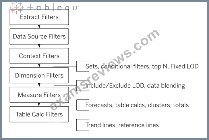
NEW QUESTION # 55
How does Tableau know at which level to aggregate values?
- A. Tableau doesn't aggregate values, we do!
- B. Aggregation is always done by using Tableau special formulas
- C. Values are always aggregated at the level of the Date Part
- D. Values are always aggregated at the level of granularity of the worksheet.
Answer: D
Explanation:
In Tableau, you can aggregate measures or dimensions, though it is more common to aggregate measures. Whenever you add a measure to your view, an aggregation is applied to that measure by default. The type of aggregation applied varies depending on the context of the view.
When you add a measure to the view, Tableau automatically aggregates its values. Sum, average, and median are common aggregations; for a complete list, see List of Predefined Aggregations in Tableau.
The current aggregation appears as part of the measure's name in the view. For example, Sales becomes SUM(Sales). Every measure has a default aggregation which is set by Tableau when you connect to a data source. You can view or change the default aggregation for a measure-see Set the Default Aggregation for a Measure.
You can change the aggregation for a measure in the view from its context menu: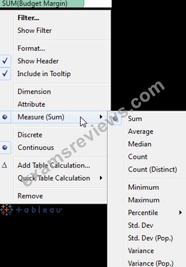
NEW QUESTION # 56
Which of the following are valid ways to export a dashboard with multiple visualisations as an image?
- A. Click on Dashboard in the Menu bar followed by Copy Image
- B. Click on Worksheet in the Menu bar followed by Export, then choose Image
- C. using the floating export worksheet option on the Dashboard
- D. Right click on the dashboard, and choose Copy, then image.
Answer: A
Explanation:
Only 1 option is correct -
Click on Dashboard in the Menu bar followed by Copy Image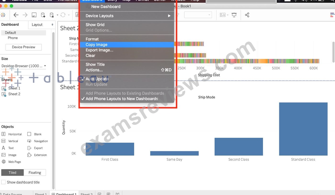
Right click on the dashboard, and choose Copy, then image - Try doing this, you will end up copying just one of the worksheets not the entire dashboard Click on Worksheet in the Menu bar followed by Export, then choose Image - Again, try doing this. You will end up copying just one of the worksheets not the entire dashboard Using the floating export worksheet option on the Dashboard - No such option exists
NEW QUESTION # 57
True or False: To concatenate fields, they must be of same data type
- A. True
- B. False
Answer: A
Explanation:
Yes! To concatenate fields, they must be of same data type. However, there is a workaround which we can use - Type casting. See below: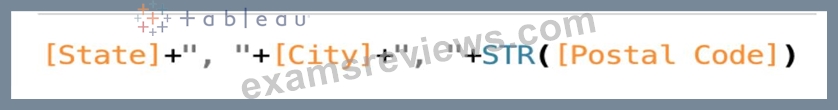
Here, State and City are Strings, but Postal Code? Nope. It's an Integer. So we can simply use the STR() function to convert it into a String, and hence the entire equation becomes valid!
NEW QUESTION # 58
You have the following visualization.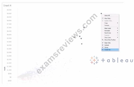
Which set type is created when you select the Create Set option?
- A. A dynamic set
- B. A combined set
- C. A fixed set
- D. A Top N set
Answer: A
Explanation:
When you use the 'Create Set' option in Tableau, it creates a dynamic set if the conditions for inclusion in the set are based on a calculation or an aggregation that may change as the data is updated or as filters are applied. Fixed sets are static and do not change with data refreshes, while dynamic sets can update to reflect the current state of the data.
NEW QUESTION # 59
In order to avoid any confusions, what should you do after creating a Dual-axis chart?
- A. Synchronise the axis
- B. Hide the axis
- C. Edit the labels
- D. Change the colours
Answer: A
Explanation:
After creating a dual axis chart, make sure to synchronise their axis since they both might not be having the same y-axis.
Graphical user interface, chart, line chart Description automatically generated
To align the two axes in a dual axes chart to use the same scale, right-click (control-click on Mac) the secondary axis, and select Synchronize Axis. This aligns the scale of the secondary axis to the scale of the primary axis.
In this example, the Sales axis is the secondary axis and the Profit axis is the primary axis.
If you would like to change which axis is the primary, and which axis is the secondary, select the field on the Columns or Rows shelf that is the secondary, and drag it in front of the primary field on the shelf until you see an orange triangle appear.
In this example, you can select the SUM(Sales) field on the Rows shelf, and drag it in front of the SUM(Profit) field. The Sales axis is now the primary and the Profit axis is the secondary.
Graphical user interface, application Description automatically generated
NEW QUESTION # 60
__________ is a technique in Tableau which will identify marks with similar characteristics
- A. Union
- B. Sets
- C. Grouping
- D. Clustering
Answer: D
Explanation:
Cluster analysis partitions marks in the view into clusters, where the marks within each cluster are more similar to one another than they are to marks in other clusters.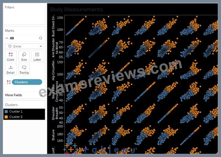
NEW QUESTION # 61
Yes or No: The number of marks will increase when you increase the number of Dimensions in a view
- A. Yes
- B. No
Answer: A
Explanation:
Of course! As an example, see below:
1) Using the Sample Superstore data, let's plot a bar chart showing the Sales for each Category: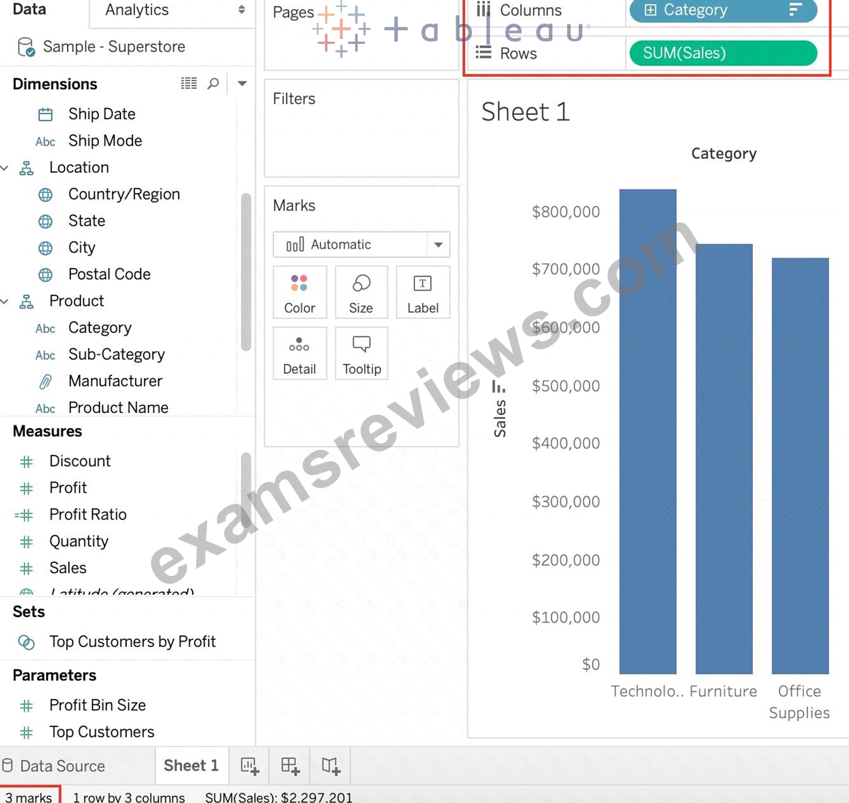
Observe that we have 3 marks - Each bar in a bar chart is called a mark. Similarly, each point in a scatter plot is also a mark , and so on for all charts.
1 row by 3 columns means that clearly on the y-axis (Sales), we have only a single mark - a single continous axis, but 3 different marks (Technology, Furniture and Office supplies ) on the x-axis.
2) Now let's add subcategory to the view as well (another dimension):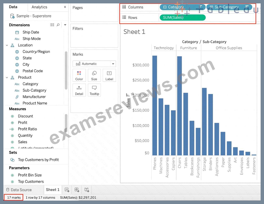
Observe that the number of marks has increased - i.e the number of Bars.
Also, notice we now have 1 row and 17 columns. Simply because 1 row = Sales (on the y-axis), and on the x-axis, we have 17 different columns (i.e product sub categories!!)
NEW QUESTION # 62
Which of the following returns the Absolute Value of a given number?
- A. ZN(Number)
- B. ABS(Number)
- C. FLOOR(Number)
- D. CEILING(Number)
Answer: B
Explanation:
Explanation
From the official Tableau website: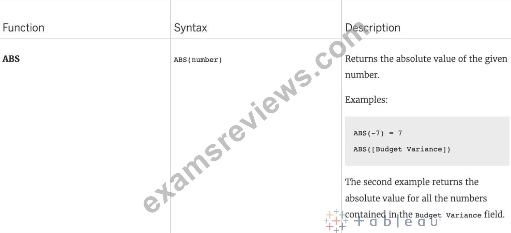
NEW QUESTION # 63
Which of the following are valid ways of Grouping Data?
- A. From the Dimensions Shelf
- B. Using Marks in the view
- C. From the Analytics Pane
- D. Using Labels in the View
Answer: A,B,D
Explanation:
Explanation
**IMPORTANT QUESTION AND EXPLANATION, PLEASE READ**
3 ways to group data -
1) Marks
2) Labels
3) Dimensions shelf.
*IMPORTANT*
If we Group the data by selecting the marks, then they remain separate marks in the view and then have the same colour. Also, a new group is created in the Dimensions shelf. Example - Using the sample superstore dataset, first plot a bar chart showing sales for each sub-category: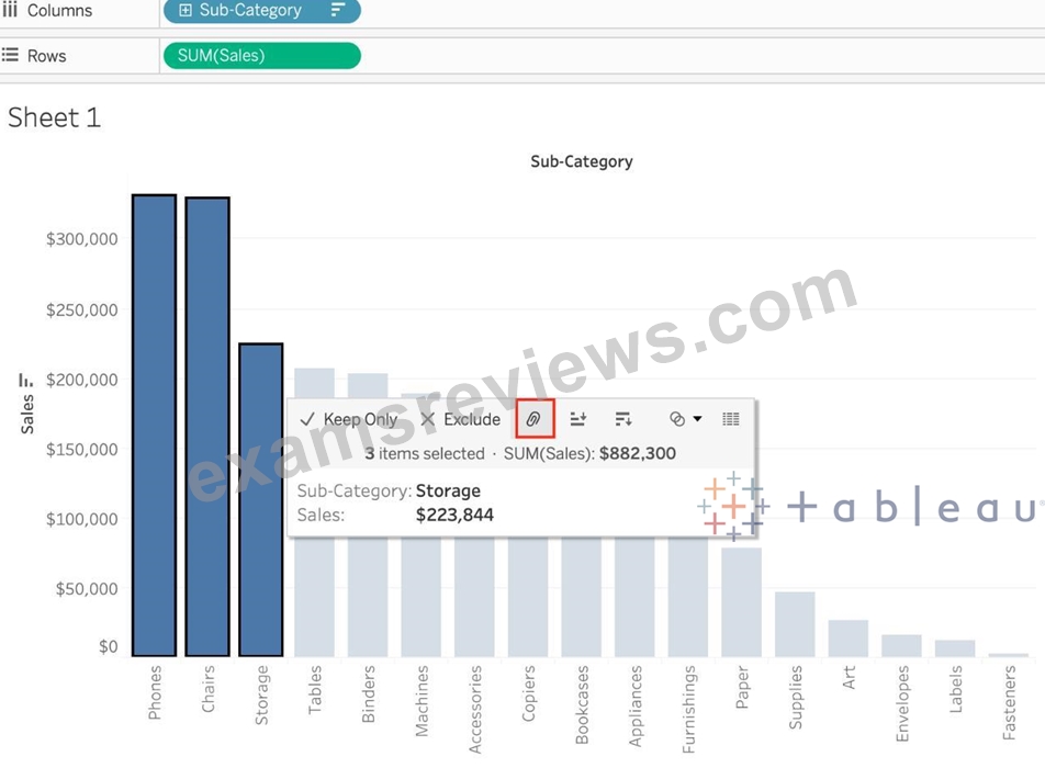
Here, if we Select Phones, Chairs and Storage by selecting the MARKS (Bars), and then group them: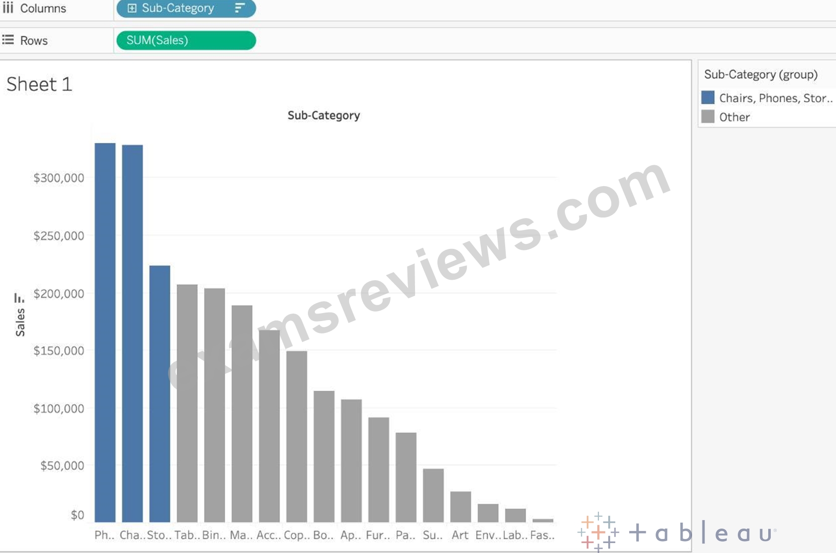
They remain seperate marks (BARS) but are grouped by the same colour.
Now, if we didn't do this, and rather grouped by selecting their Labels (Names):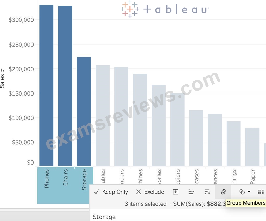
Then they no longer remain separate Marks (bars) but are rather consolidated into a single Bar: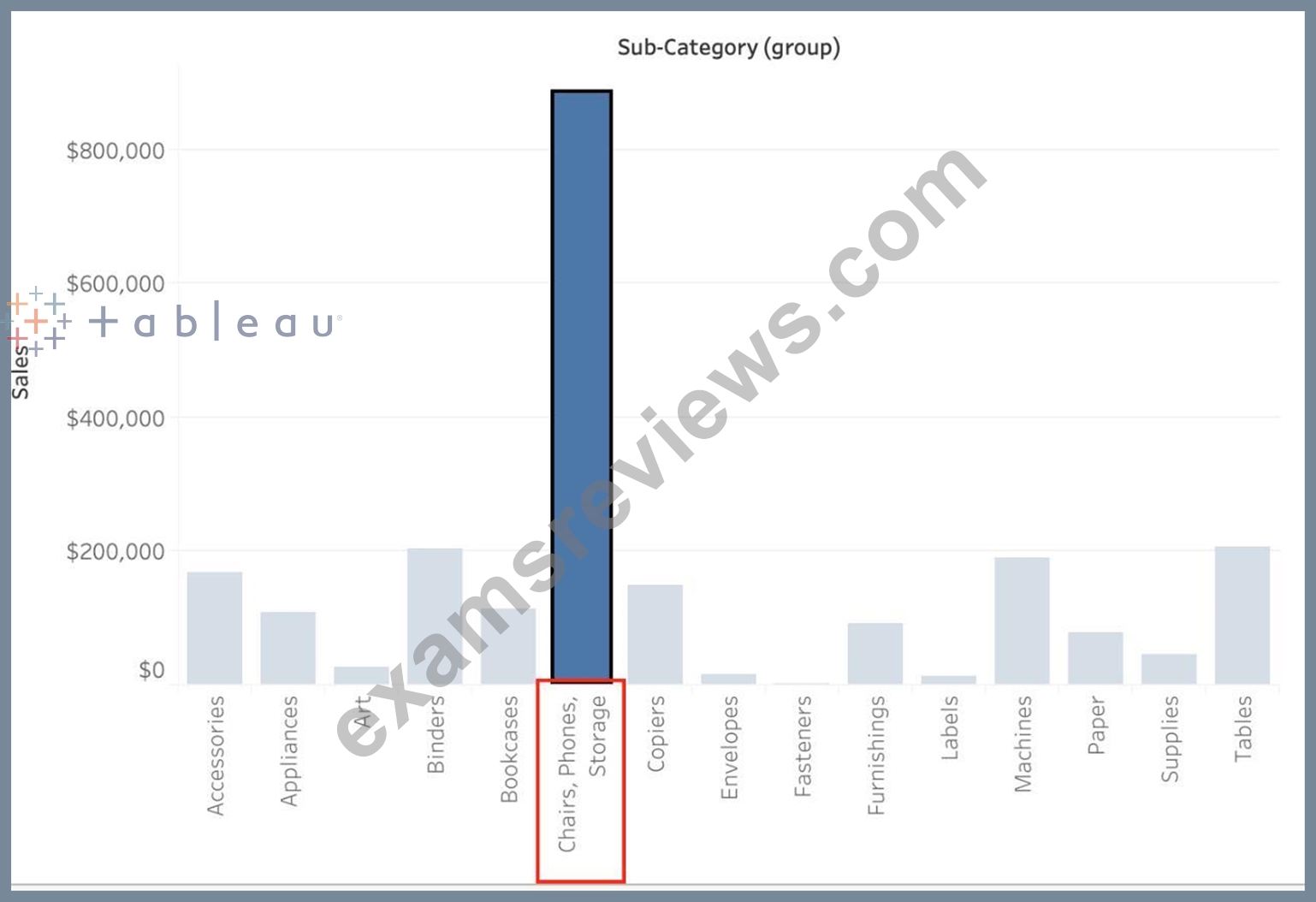
Finally, we can group directly from the Dimensions shelf as follows: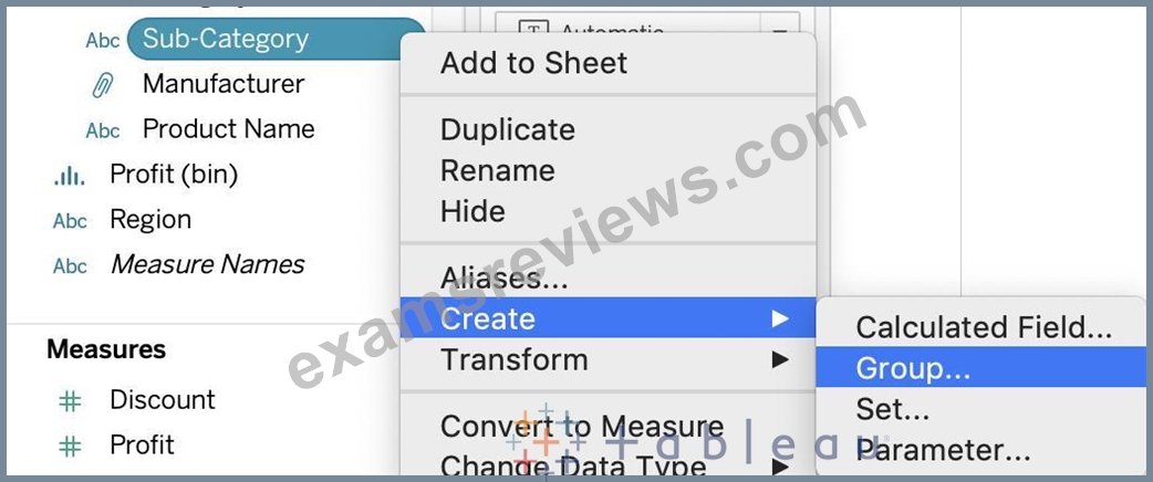
Now choose Phones, Chairs and Storage and Click Group: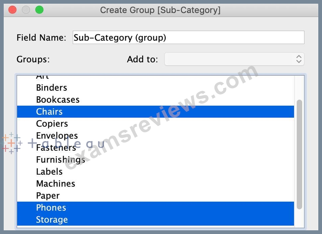
You will now automatically have a new Dimension as follows:
NEW QUESTION # 64
Is it possible to use measures in the same view multiple times (e.g. SUM of the measure and AVG of the measure)?
- A. Yes
- B. No
Answer: A
Explanation:
Yes, it is very much possible to use measures in the same view multiple times. For example, refer to the image below: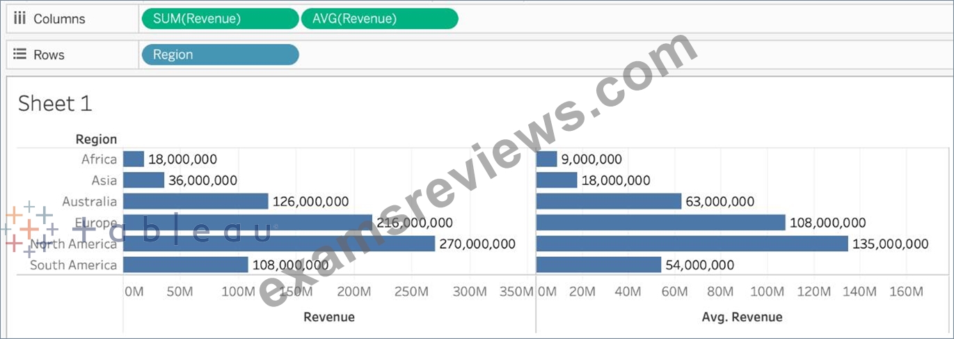
We are using BOTH the Sum of the revenue and the AVG of the revenue in the same view!
NEW QUESTION # 65
By default, what does Tableau do when you connect to a data source?
- A. Sorts the data in descending order
- B. Loads your actual file into Tableau
- C. Creates a live connection to the data
- D. Creates an extract of the data
Answer: C
Explanation:
Before you can build a view and analyze your data, you must first connect Tableau to your data. Tableau supports connecting to a wide variety of data, stored in a variety of places.
By default, when you connect a data source to Tableau, Tableau will create a live connection to the data.
Live connection refers to a data source that contains direct connection to underlying data, which provides real-time or near real-time data. With a live connection, Tableau makes queries directly against the database or other source, and returns the results of the query for use in a workbook. Users can create live connections and then share them on Tableau Server so that other Tableau users can use the same data using the same connection and filtering settings.
NEW QUESTION # 66
_____________ is a snapshot of the data that Tableau stores locally. Good for very large datasets of which we only need few fields.
- A. Tableau Data Extract (.tde)
- B. Tableau Workbook (.twb)
- C. Tableau Data Source (.tds)
- D. Tableau Packaged Workbook (.twbx)
Answer: A
Explanation:
Explanation
Tableau Data Extract (TDE) is a snapshot of the data that Tableau stores locally. Good for very large datasets of which we only need few fields. Performance is optimised because it queries its own database engine instead of the local data source.
When you create an extract of your data, you can reduce the total amount of data by using filters and configuring other limits. After you create an extract, you can refresh it with data from the original data. When refreshing the data, you have the option to either do a full refresh, which replaces all of the contents in the extract, or you can do an incremental refresh, which only adds rows that are new since the previous refresh.
Extracts are advantageous for several reasons:
1) Supports large data sets: You can create extracts that contain billions of rows of data.
2) Fast to create: If you're working with large data sets, creating and working with extracts can be faster than working with the original data.
3) Help improve performance: When you interact with views that use extract data sources, you generally experience better performance than when interacting with views based on connections to the original data.
4) Support additional functionality: Extracts allow you to take advantage of Tableau functionality that's not available or supported by the original data, such as the ability to compute Count Distinct.
5) Provide offline access to your data: Extracts allow you to save and work with the data locally when the original data is not available. For example, when you are traveling.
NEW QUESTION # 67
Larger image
What is this view referred to as in Tableau?
- A. Dimensions & Measures
- B. Window Pane
- C. Analytics Pane
- D. Data Pane
Answer: D
Explanation:
Tableau displays data source connections and data fields for the workbook in the Data pane on the left side of the workspace.
The Data pane includes:
Dimension fields - Fields that contain qualitative values (such as names, dates, or geographical data). You can use dimensions to categorize, segment, and reveal the details in your data. Dimensions affect the level of detail in the view. Examples of dimensions include dates, customer names, and customer segments.
Measure fields - Fields that contain numeric, quantitative values can be measured. You can apply calculations to them and aggregate them. When you drag a measure into the view, Tableau applies an aggregation to that measure (by default). Examples of measures: sales, profit, number of employees, temperature, frequency.
For more information on what dimensions and measures are, see Dimensions and Measures, Blue and Green.
Calculated fields - If your underlying data doesn't include all of the fields you need to answer your questions, you can create new fields in Tableau using calculations and then save them as part of your data source. These fields are called calculated fields.
For more information on calculated fields, see Create Custom Fields with Calculations.
Sets - Subsets of data that you define. Sets are custom fields based on existing dimensions and criteria that you specify. For more information, see Create Sets.
Named sets from an MS Analysis Services server or from a Teradata OLAP connector also appear in Tableau in this area of the Data pane. You can interact with these named sets in the same way you interact with other custom sets in Tableau.
Parameters - Values that can be used as placeholders in formulas, or replace constant values in calculated fields and filters. For more information, see Create Parameters.
NEW QUESTION # 68
Which of the following is the correct way to calculate Profit Ratio in Tableau?
- A. Sales / Profit
- B. SUM(Sales)/SUM(Profit)
- C. Profit / Sales
- D. SUM(Profit) / SUM(Sales)
Answer: D
Explanation:
THIS IS A VERY IMPORTANT QUESTION
Aggregation is an important concept to consider when creating calculated fields. A calculated field for SUM([Profit]) / SUM([Sales]) will give you a very different answer than [Profit] / [Sales], even though both formulas are valid.
If you do not provide the aggregation within the calculated field, Tableau will calculate the equation for every record ( row ) in your analysis, then aggregate the answers for all of the rows together when the calculated field is added to the view.
In simple terms, if specify the aggregation such as SUM, what Tableau will do is that it will first calculate the sum of the Profit column ( say x ), then calculate the sum of the Sales column ( say y ), and then simply apply x/y ---> This is what we expect! Perfect!
BUT, if you don't specify the aggregation, it will go to every single ROW, perform Profit / Sales, and then aggregate the answers calculated for each row. This is simply NOT what we wan't!
An example: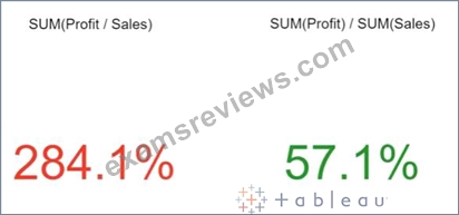
NEW QUESTION # 69
You can create _______________ for members in a dimension so that their labels appear differently in the view.
- A. copies
- B. aliases
- C. parameters
- D. duplicates
Answer: B
Explanation:
Explanation
You can create aliases (alternate names) for members in a dimension so that their labels appear differently in the view.
Aliases can be created for the members of discrete dimensions only. They cannot be created for continuous dimensions, dates, or measures.
To create an alias: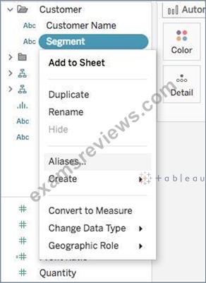
1) In the Data pane, right-click a dimension and select Aliases.
2) In the Edit Aliases dialog box, under Value (Alias), select a member and enter a new name.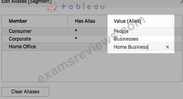
* To submit your changes: In Tableau Desktop, click OK.
On Tableau Server or Tableau Online, click the X icon in the top-right corner of the dialog box.
When you add the field to the view, the alias names appear as labels in the view. For example:
NEW QUESTION # 70
Using the dataset provided, create a crosstab showing the Profit of each Region per Year, then add grand totals to the view. What was the total Profit for Canada in 2012 and the total Profit for Canada for 2011 through
2014, respectively?
- A. 1,807 and 34,571
- B. 52,678 and 311,404
- C. 5,129 and 88,872
- D. 4,888 and 17,817
Answer: D
Explanation:
To reach the correct answer, follow these steps:
1) Drag Order Date (Discrete Year) to the Column shelf, and Region to the Row Shelf as shown: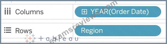
2) Drag Profit to Text in the Marks Shelf as shown: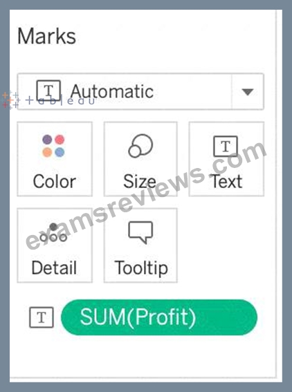
3) Click on Analysis as shown -> Totals -> SELECT ROW GRAND TOTALS
The following will be the final view: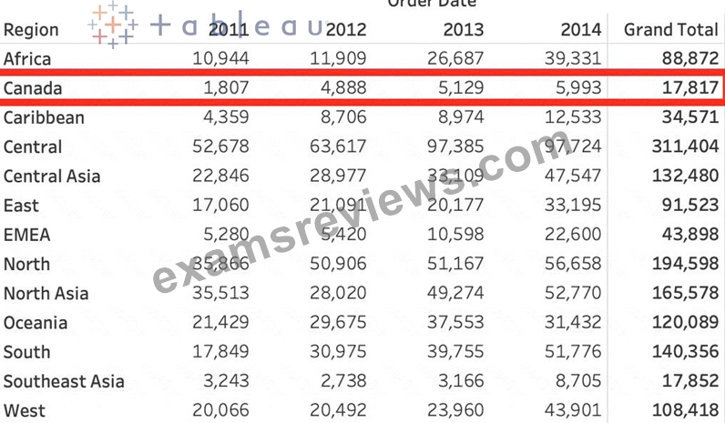
You could also Filter by Region to only Focus on Canada, but that's your choice: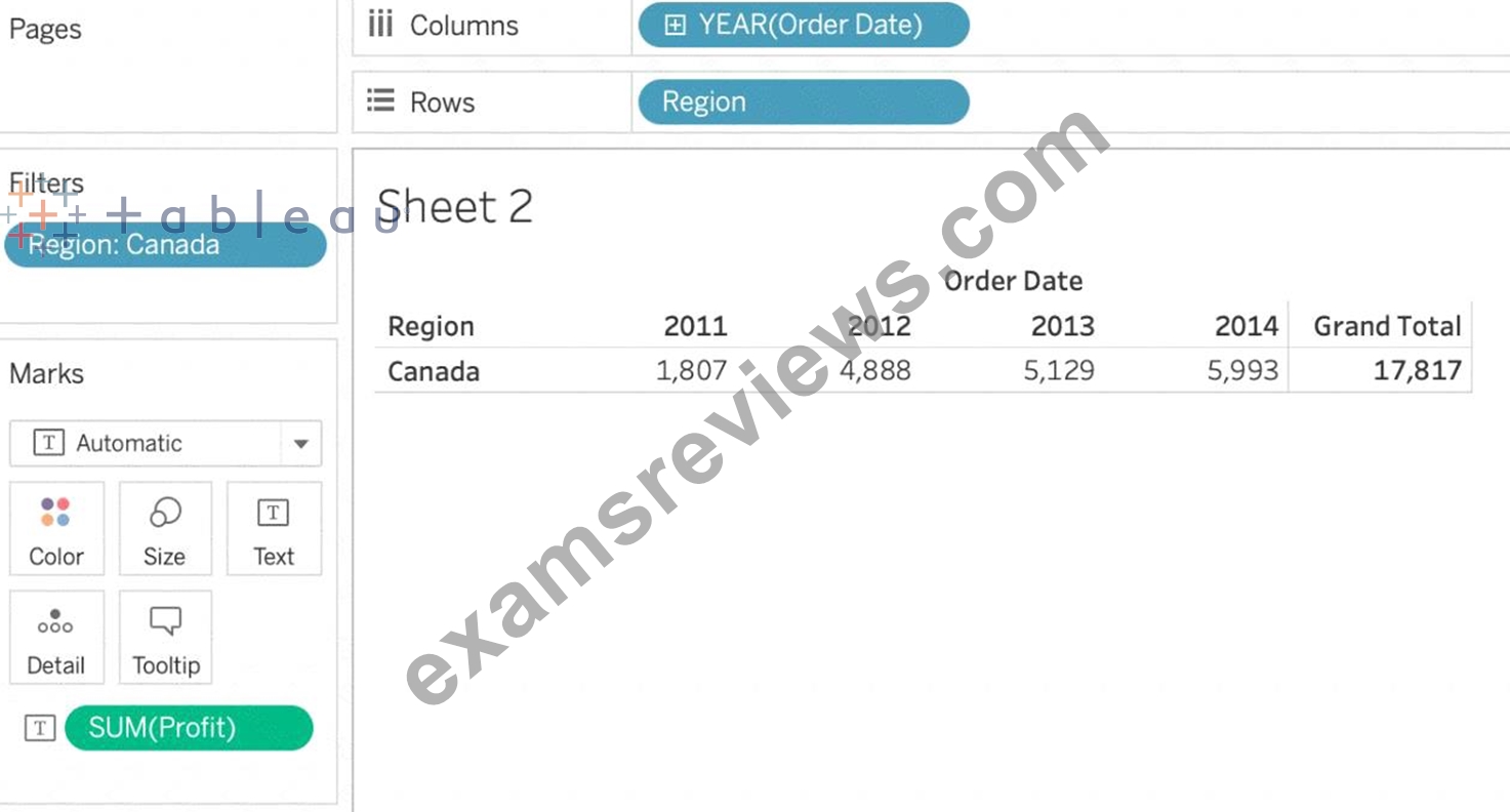
THEREFORE,
2012 = 4,888
2011 -> 2014 = 17,817
NEW QUESTION # 71
Download the Dataset from: https://drive.google.com/file/d/12AYHfiPWkwBmvH0zbumOURgUX6Az00Rw/view?usp=sharing Using the Time Series Table, create a line chart to show Sales over time. Which Month and Year witnessed the lowest Sales?
- A. December 2017
- B. September 2017
- C. March 2018
- D. January 2018
Answer: D
Explanation:
Follow the steps to get the correct answer : January 2018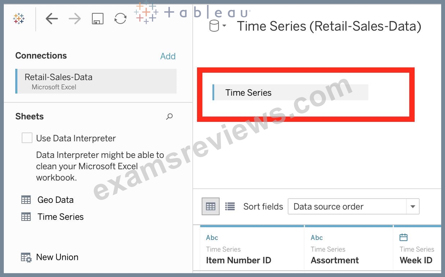
We are talking about dates, so use the Time series sheet as follows: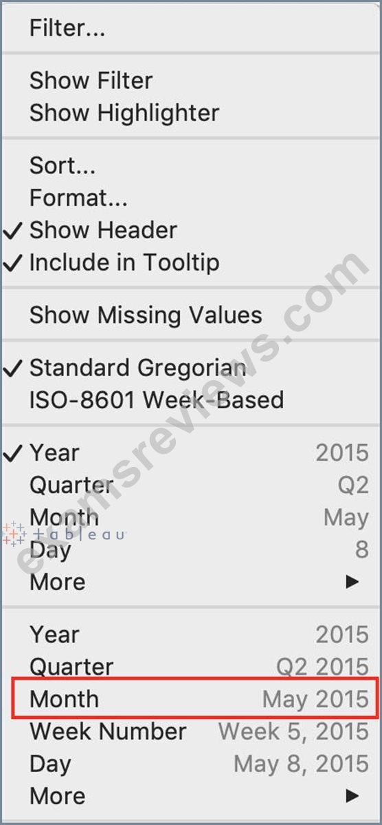
Next, the following should be your view and clearly, January 2018 is the lowest point: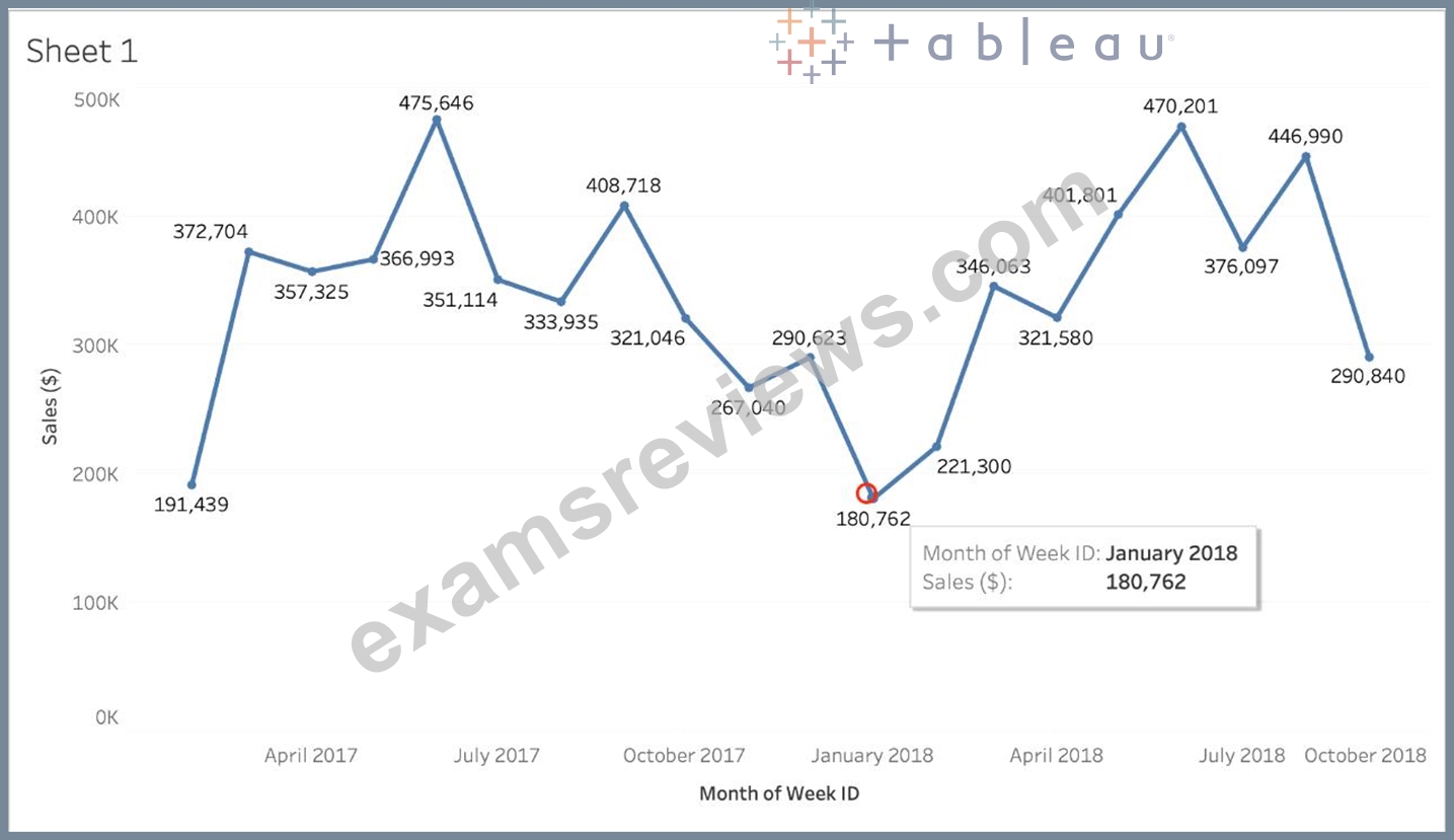
Read more about dates: https://interworks.com/blog/rcurtis/2017/01/30/tableau-deep-dive-dates-introduction-dates/
NEW QUESTION # 72
Using the CoffeeChain table, create a chart to see the monthly Percent difference change in Profit, from the beginning of 2012 to the end of 2013. How many months saw a Negative percent difference in Profit?
- A. 0
- B. 1
- C. 2
- D. 3
Answer: D
Explanation:
Explanation
Follow along to reach the correct answer:
1) First, drag Date to the Column shelf and Profit to the Rows shelf. We need to see the 2 consecutive months over this two year period (2012-2013) so this tells us we need to work with continuous dates:
Click on Date in the Column shelf and convert it to continuous month :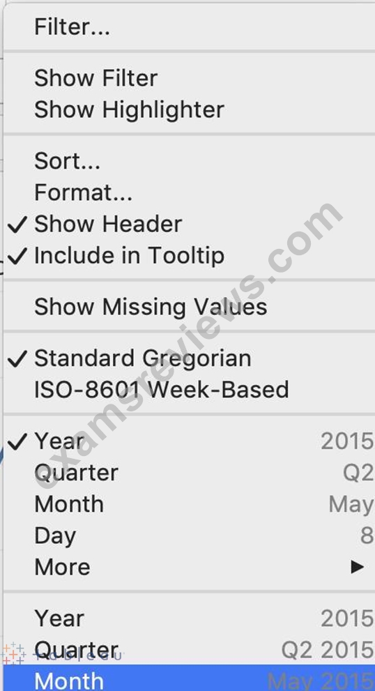
2) Now, click on the Profit pill in the Rows shelf, go to quick table calculation and choose Percent difference: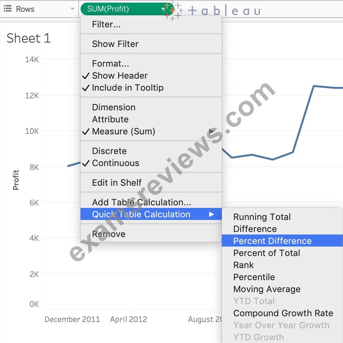
3) Finally, click on the Show mark Labels icon:
4) We finally have our view, and clearly, 10 Months have a NEGATIVE percent difference: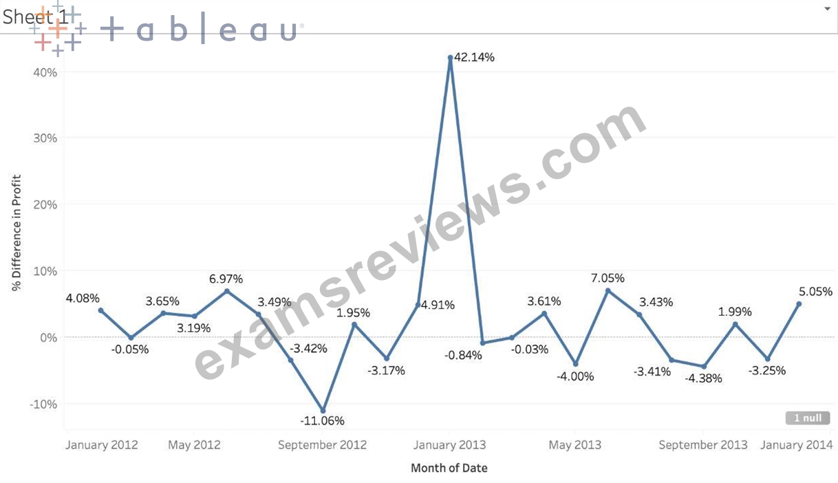
NEW QUESTION # 73
What is the one most important thing you should do after creating a Dual-axis chart?
- A. Synchronise the axis
- B. Hide the axis
- C. Edit the labels
- D. Change the colours
Answer: A
Explanation:
After creating a dual axis chart, make sure to synchronise their axis since they both might not be having the same y-axis.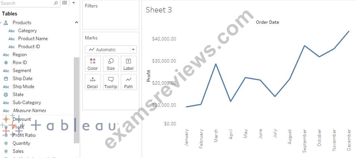
To align the two axes in a dual axes chart to use the same scale, right-click (control-click on Mac) the secondary axis, and select Synchronize Axis. This aligns the scale of the secondary axis to the scale of the primary axis.
In this example, the Sales axis is the secondary axis and the Profit axis is the primary axis.
If you would like to change which axis is the primary, and which axis is the secondary, select the field on the Columns or Rows shelf that is the secondary, and drag it in front of the primary field on the shelf until you see an orange triangle appear.
In this example, you can select the SUM(Sales) field on the Rows shelf, and drag it in front of the SUM(Profit) field. The Sales axis is now the primary and the Profit axis is the secondary.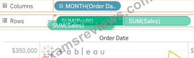
NEW QUESTION # 74
......
Tableau TDS-C01 exam tests the candidate's proficiency in using Tableau Desktop, a powerful software tool used for data visualization and business intelligence. TDS-C01 exam comprises of multiple-choice questions and performance-based tasks that evaluate the candidate's ability to create, publish, and share interactive data dashboards. TDS-C01 exam is available in several languages and can be taken online or in-person at a testing center.
Pass Tableau With ExamsReviews Exam Dumps: https://www.examsreviews.com/TDS-C01-pass4sure-exam-review.html
Fully Updated TDS-C01 Dumps - 100% Same Q&A In Your Real Exam: https://drive.google.com/open?id=1hU4U7wCq8XZ4D-j1GS2Md_4F8VqPyqOn